कुछ इश्क़, कुछ काम
कुछ इश्क़, कुछ काम

Exploring the intersections of communication and experiential design.



Exploring the intersections of communication and experiential design.

<!--
Project info
-->
Services:
Branding, Event Design
Year:
2026
Industry:
Arts

Introduction
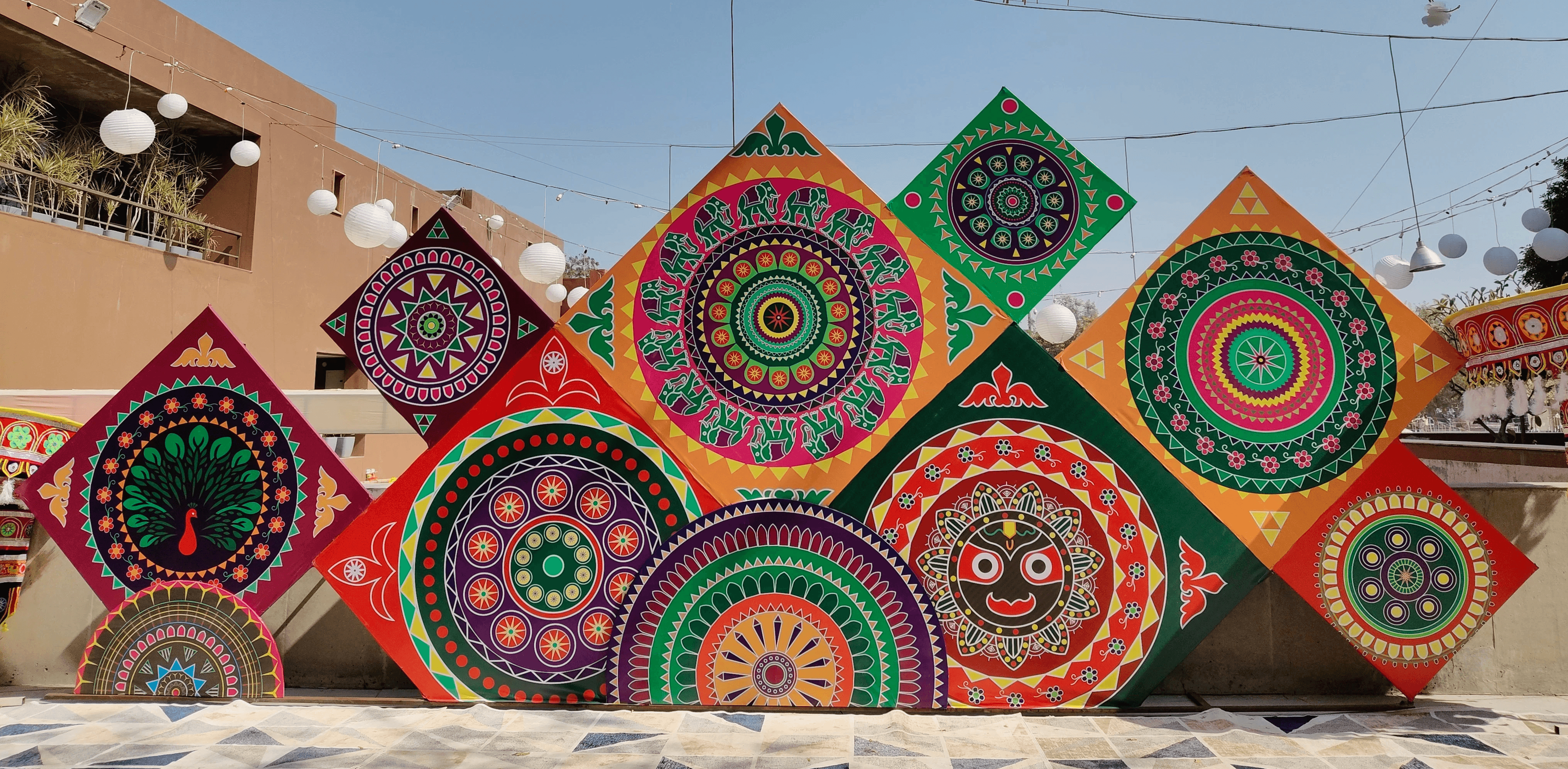
This graduation project focuses on designing the visual identity for the Lodhi Art Festival 2026, organised by St+art India Foundation. It explores creating a cohesive and adaptable identity system across print, digital, and spatial applications, aimed at engaging diverse audiences while responding to the cultural and urban context of a public art festival.
Introduction
This graduation project focuses on designing the visual identity for the Lodhi Art Festival 2026, organised by St+art India Foundation. It explores creating a cohesive and adaptable identity system across print, digital, and spatial applications, aimed at engaging diverse audiences while responding to the cultural and urban context of a public art festival.


Vision
This year’s Lodhi Art Festival placed a strong emphasis on introducing a new generation of artists, creating space for fresh voices, perspectives, and practices within the public art landscape. This shift not only diversified the artistic output but also made the festival feel more current, experimental, and reflective of evolving creative practices.
This year’s Lodhi Art Festival placed a strong emphasis on introducing a new generation of artists, creating space for fresh voices, perspectives, and practices within the public art landscape. This shift not only diversified the artistic output but also made the festival feel more current, experimental, and reflective of evolving creative practices.
The visual language of the festival, therefore, needed to resonate with this energy: dynamic, flexible, and capable of accommodating multiple artistic identities. Rather than imposing a rigid or uniform aesthetic, the approach was to create a system that could hold diversity while maintaining coherence.
The visual language of the festival, therefore, needed to resonate with this energy: dynamic, flexible, and capable of accommodating multiple artistic identities. Rather than imposing a rigid or uniform aesthetic, the approach was to create a system that could hold diversity while maintaining coherence.

Stencils are inherently connected to street art culture. They are quick, repeatable, and adaptable, often used in urban environments to create bold, high-contrast visuals that can exist across different surfaces. This quality made them particularly relevant for a festival situated within a public, urban context.
This flexibility made it possible to accommodate diverse artistic voices without imposing uniformity. Additionally, the imperfections inherent in stencil application, such as overlaps, misalignments, and texture, became a deliberate part of the visual language. Rather than striving for precision, the identity embraces irregularity, reflecting the organic and evolving nature of the festival.
Stencils are inherently connected to street art culture. They are quick, repeatable, and adaptable, often used in urban environments to create bold, high-contrast visuals that can exist across different surfaces. This quality made them particularly relevant for a festival situated within a public, urban context.
This flexibility made it possible to accommodate diverse artistic voices without imposing uniformity. Additionally, the imperfections inherent in stencil application, such as overlaps, misalignments, and texture, became a deliberate part of the visual language. Rather than striving for precision, the identity embraces irregularity, reflecting the organic and evolving nature of the festival.

Conclusion
Looking back at this project, what stands out most is not just the final outcome, but everything that unfolded in between, the uncertainty, the iterations, the conversations, and the constant learning that came with it. What began as a process of brainstorming ideas and exploring visual directions gradually evolved into something much larger and more complex than I had anticipated. View my entire project documentation here.
Looking back at this project, what stands out most is not just the final outcome, but everything that unfolded in between, the uncertainty, the iterations, the conversations, and the constant learning that came with it. What began as a process of brainstorming ideas and exploring visual directions gradually evolved into something much larger and more complex than I had anticipated. View my entire project documentation here.